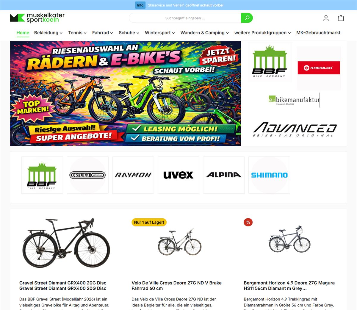
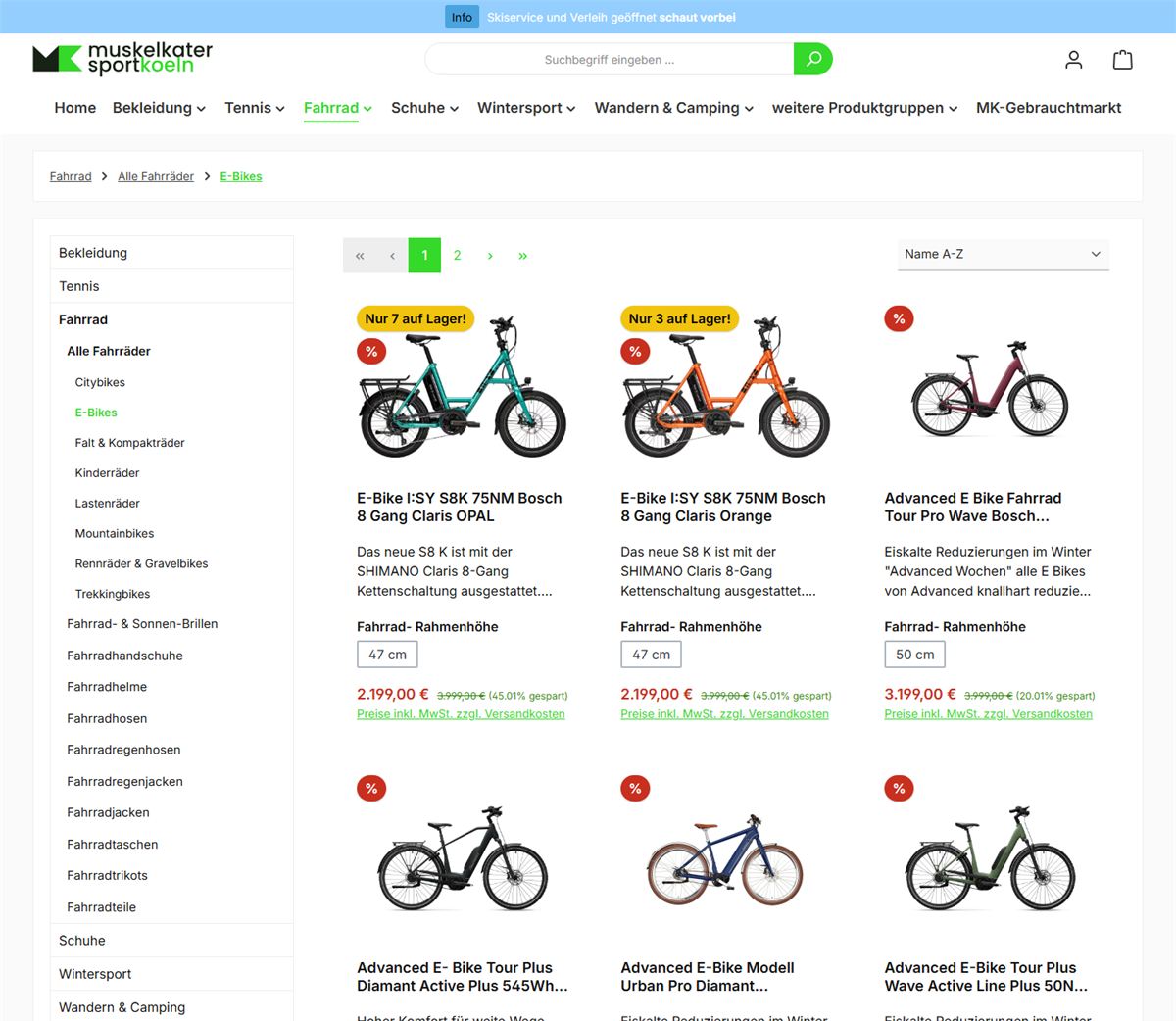
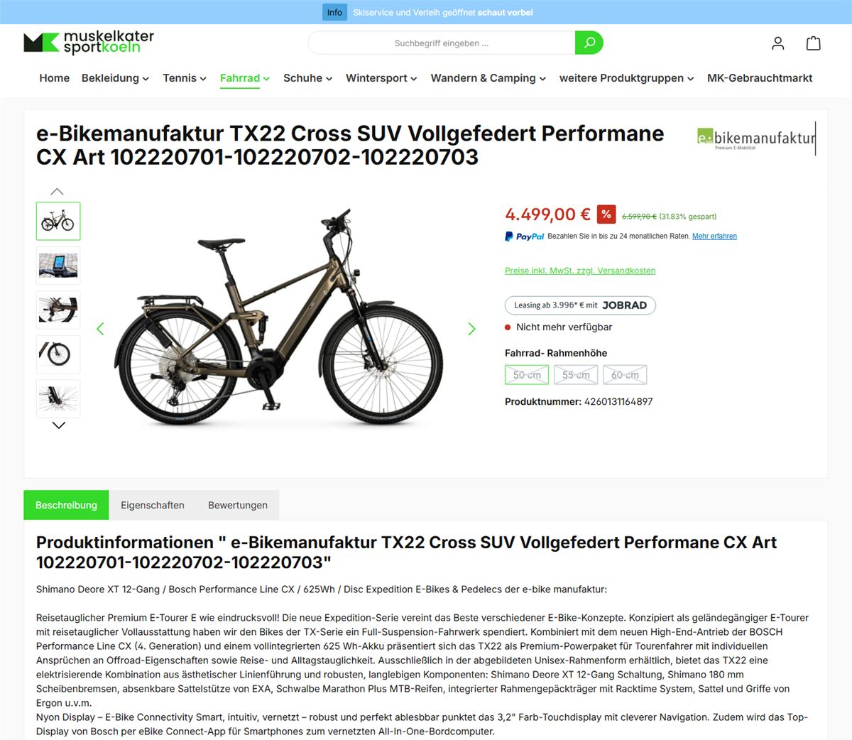
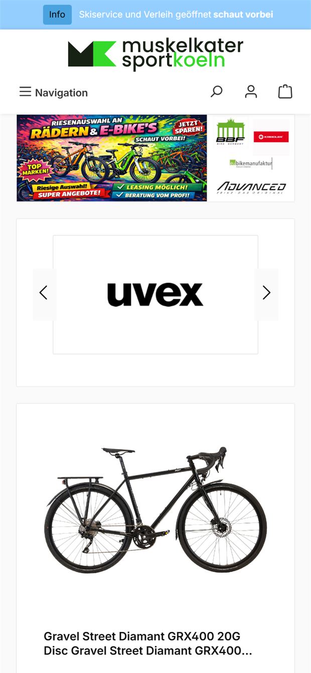
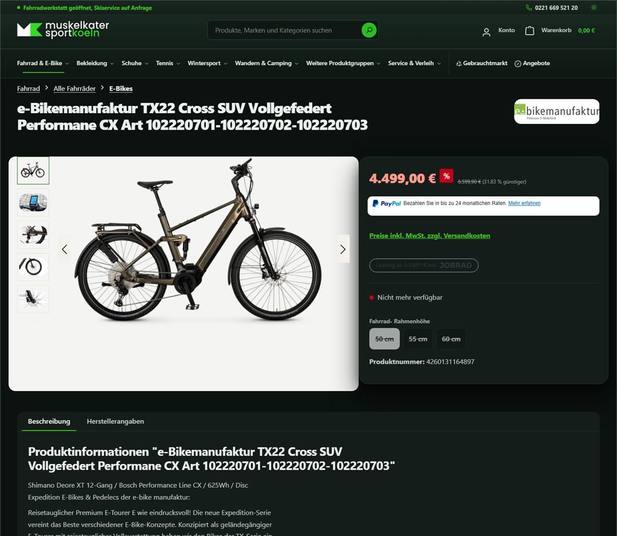
Muskelkater Sport in Cologne-Zollstock sells bicycles, skis and tennis rackets – and has done so online for years. Technically the shop ran cleanly, but it looked like an off-the-shelf kit. I rebuilt the interface completely: custom theme, new navigation, new home page, a rental calculator and a dark mode. It has been running in the real shop since August. Then came the second part – bringing over the stock of the previous shop. The slider fades between the two versions.
Four pages from the same shop: on the left the version that was online until the switchover, on the right the one that is there now. The slider, a tap on the image or the arrow keys fade between the two versions.
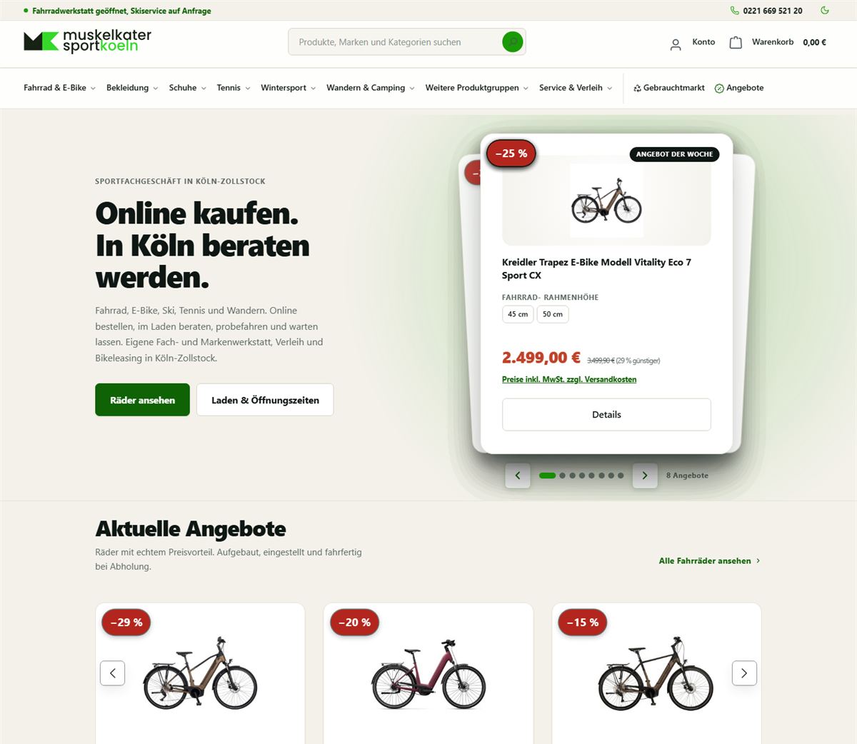
Home page. The full-width advertising banner gives way to a welcome area that says in one sentence what it is about: buy online, get advice in the shop. Address, opening hours and phone number now sit at the top instead of at the very bottom. Below them follow offers, range, workshop and rental in a fixed order – instead of a long chain of identical-looking product rows.
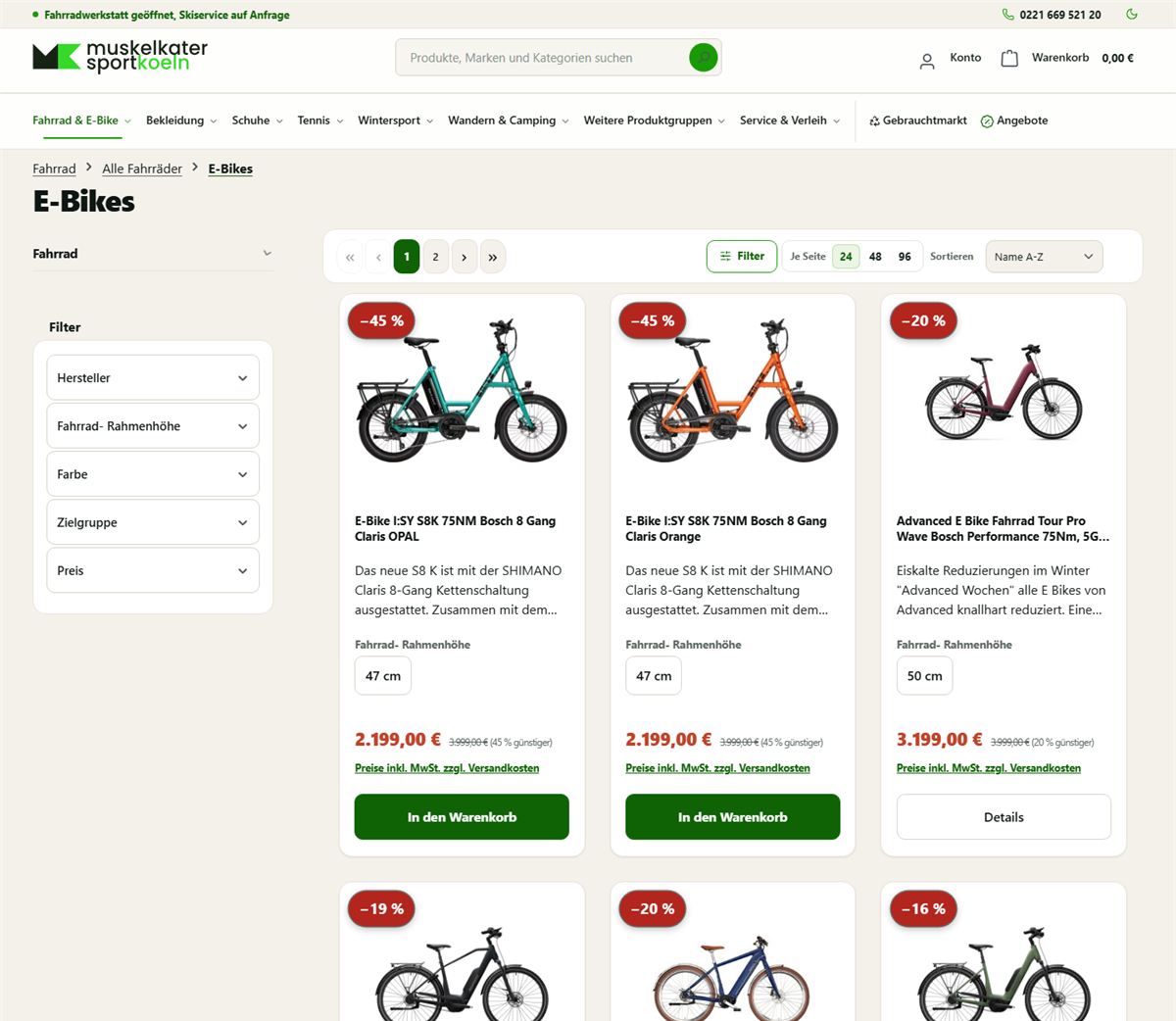
Category. Before, the sidebar held the entire category tree from the root – in other words, the header navigation a second time. Now it shows only the open section and its neighbours, calculated from the active category instead of from a maintained list. Added to that: a heading that says where you are, discounts as a real percentage (−45 % instead of a bare percent sign) and a buy button that is always visible.
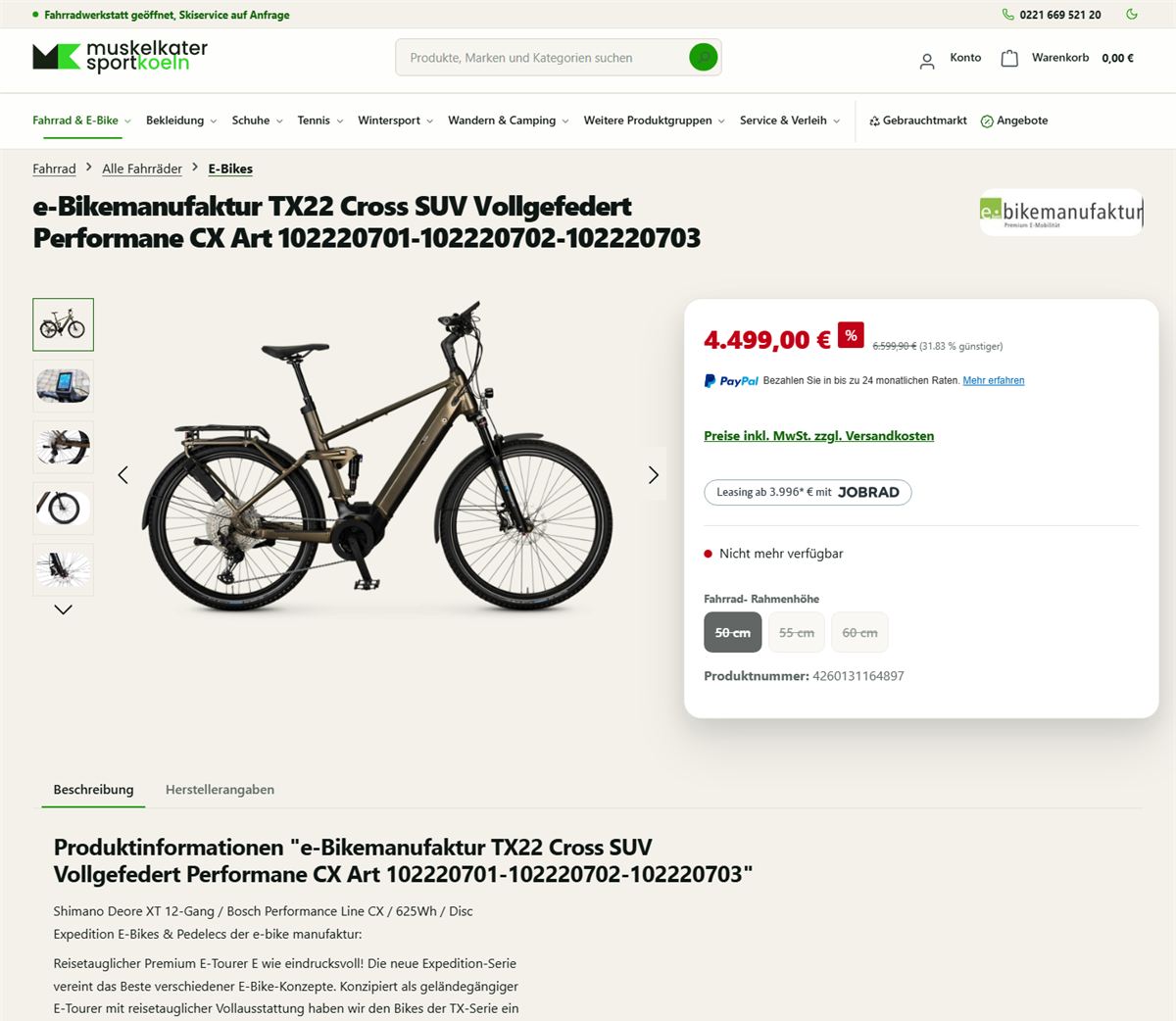
Product page. Everything that belongs to buying – price, size, availability, leasing rate – now sits together in a separate card instead of being scattered through the body text. The description gets a readable line length, and the breadcrumb trail is recognisable as a trail instead of disappearing in the same colour as the background.
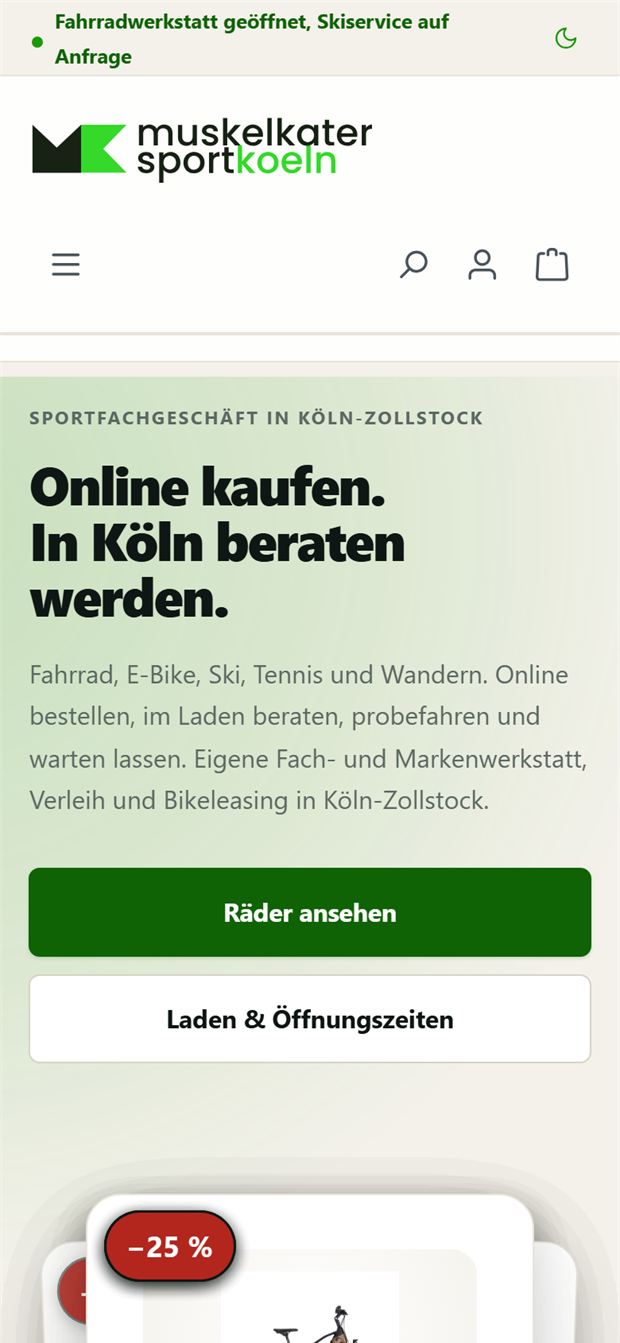
On mobile. Around two thirds of visitors come on their phone. Before, advertising banners and a brand carousel filled the whole first view, without a word about what the shop actually does. Now that is on the first screen, with two buttons within thumb reach.
Left: 1 August 2026, the last day of the old shop. Right: 2 August 2026, captured on the day of the switchover directly from the live site. Both in the same browser and at the same window width, so that the comparison holds.
The left-hand page no longer exists on the web. It only survives as a backup on my side – and that is exactly why it is shown here.
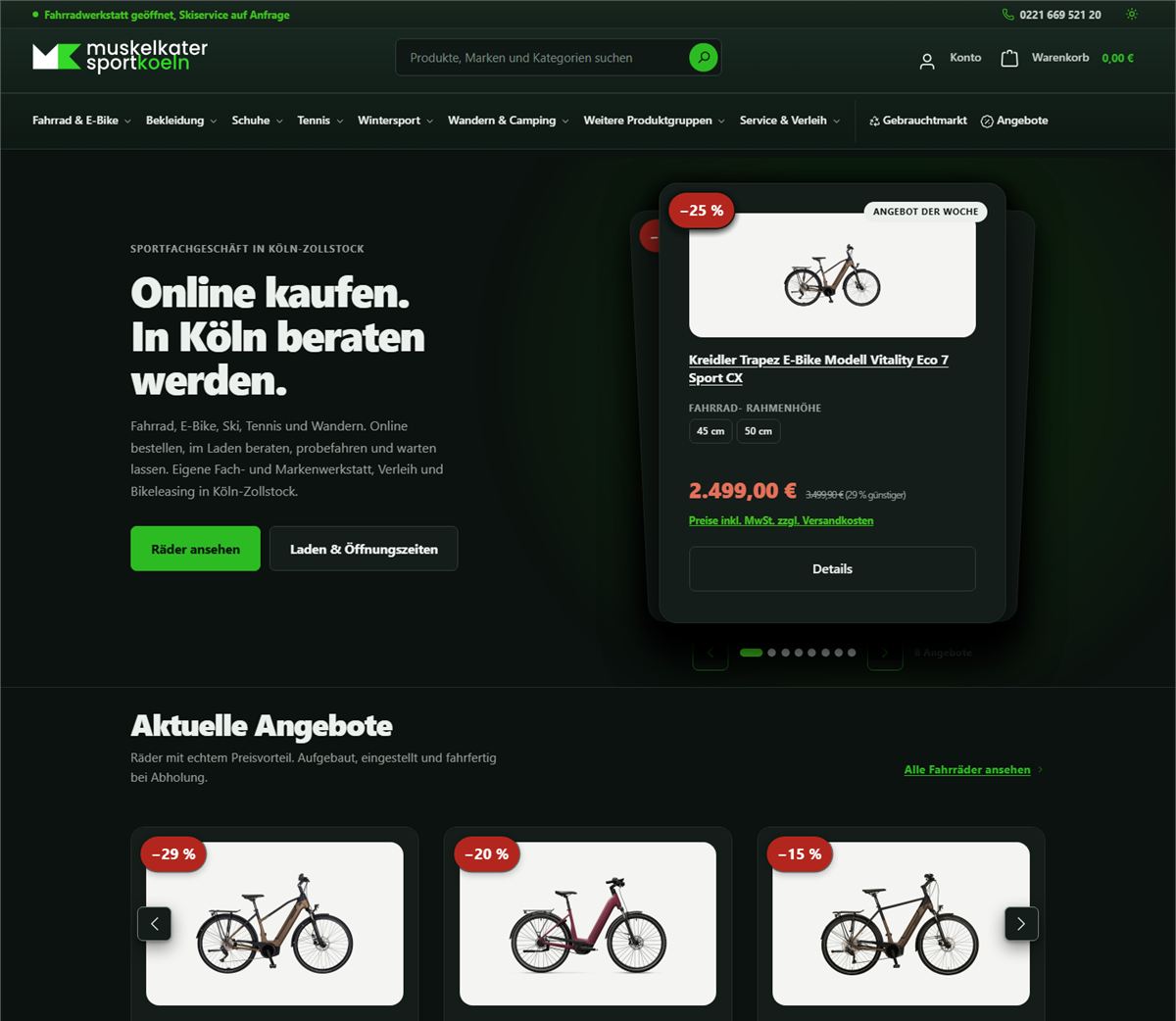
The easy way would have been to invert all brightness values: a filter over the page, done. The result is familiar – grey photos, washed-out colours and text stuck halfway between foreground and background. Instead, every surface, every line and every text colour got its own dark value. The slider compares both versions.
Home page. The background does not turn black but a very dark green – the same family as the brand, just at the very bottom of the scale. The brand green goes the opposite way and becomes lighter; otherwise it would vanish into the background.
Product page. The most interesting case: product photos are cut out, so their background is white. Invert the page bluntly and the bikes float in a bright box that has nothing to do with the rest. That is why image areas keep their light card – they are now deliberately placed elements instead of leftovers.
Background, cards, lines, text, brand, warning colours: every value has its own dark counterpart. That is more work than a filter – and the only way in which colours stay colours.
The first pass found 42 places below the AA standard. They could be traced back to nine causes – fixing those fixes all 42.
Cut-out product images keep their light surface. Otherwise a bike on a white background looks like a forgotten clipping on a dark page.
Forms, tables, select fields, overlays, notice bars, the empty basket: the places people think of last in the dark, and where it shows first.
A toggle at the top right is all it takes. The choice is remembered and applied on the next visit, before the page is drawn – which is why nothing flashes white while loading.
A moon icon alone tells a screen reader nothing. The toggle carries a label that still works when nobody sees the icon.
No new logo, no new brand – the substance of the shop stays. What has changed is everything that stands between visitor and goods.
| Area | Before | After |
|---|---|---|
| First impression | Full-width advertising banner, products straight after | One sentence explaining the shop, plus address, hours and phone |
| Header navigation | Flat bar, subcategories only after several clicks | Eight main items with seven drop-down menus, built from the real category tree |
| Mobile menu | The same items several times, service hidden | Quick access, collapsible service section, shop info at the end |
| Sidebar in categories | The complete category tree from the root | Only the open section – calculated from the active category |
| Buy button on mobile | Not reachable – only appeared on mouse hover | Always visible, without covering the price |
| Discount badges | A bare “%” with no number | The real value from the price data, e.g. −45 % |
| Price format | “(45.01% gespart)” (“saved”) | “(45 % günstiger)” (“cheaper”) |
| Typeface | Named 73 times in the stylesheet – and never loaded | Defined system font stack: available instantly, no request to third parties |
| Footer | Four background surfaces stacked on top of each other | One continuous surface, four ordered columns |
| Empty basket | One line of text | Heading, explanation and two routes back into the range |
| Dark mode | Not available | Complete, with measured contrasts |
| Rental prices | Eight price tables to search through | Three questions, one price – the calculator further down |
The table has three columns – on a phone it can be swiped sideways.
Design is open to debate, contrast is not. All visible text elements on the home, category and product pages were measured against the WCAG AA standard – before and after, with the same script.
Also a result: Four of the errors found were not design questions at all, but had already been in the shop before – the buy button that could not be reached on touch devices, white text on light green, the footer stacked four times, and a search magnifier without a size that blew up to 300 × 150 pixels. I found them because, when measuring, I was not looking for my own changes but for everything.
And one more: my first measuring script was itself wrong. It looked for the background in the parent tree and hit the wrong surface in the footer and on buttons – it reported 1.15:1, the actual value was 9.6:1. Measuring means checking the measurement too.
Design and programming are mine – from the first draft to the Twig templates running in the shop. What I did not touch: the shop's range, prices, product images and texts.
Colours, font sizes, radii, shadows and spacing as one coherent set of values – not as a collection of individual cases. Every colour has been calculated against its background.
Built as a standalone theme plugin, with Twig templates and SCSS. The most important values and texts can be set in the administration area, so that nobody has to touch code later.
Drop-down menus for desktop, a separate menu for mobile and a section column derived from the active category. No fixed IDs and no name list – new categories appear on their own.
Welcome area, range tiles, trust bar, offers, workshop and rental, location. Built as CMS content so that the shop can change the order itself.
New tile for the grid, new buy area on the product page, real discount values, readable price format, visible buy button.
Eight price tables condensed into three questions. Plain JavaScript, no library, usable as a CMS block. Runs further down on this page.
Six ready-made blocks – benefits, service, products, rental prices, questions and answers, location – that can be placed in any page without programming knowledge. They adapt to their own width, not that of the window.
A second, complete colour system instead of inverted brightness – including the places nobody otherwise thinks of in the dark: forms, tables, overlays, notice bars.
Icon set and illustrations drawn as vector graphics: sharp on every screen, a few kilobytes, in the theme's colour.
Before anything was changed in the shop, the complete draft existed as a single HTML file to double-click – no installation, no internet. That made it possible to see beforehand what the new shop would look like.
Custom console commands that create products, variants, images, manufacturers and categories in Shopware from the database dump of the previous shop – together with the review pages that show beforehand what would come out of it.
Technical concept for online reservations with a deposit: period, availability, preparation time, status flow – plus a PHP skeleton with an interchangeable connection to the inventory management system, and tests.
Contrasts measured, heading order checked, unnamed buttons named, click targets spaced out, keyboard operation tested.
Show first, then build, then switch on – and every step in a way that it can be reversed on its own. The running shop was never affected at any point; all work was done in a separate test environment.
The complete shop as a clickable draft in one file: home page, navigation, category, product page, banner designs. To double-click, no installation – the basis for everything that followed.
Six embeddable blocks that the shop can place itself. Each responds to its own width – the same file looks different in the narrow column than across the full page.
The new home page and eight service pages – workshop, bike leasing, e-bike, ski and snowboard rental, ski service, boot fitting, tennis stringing – with the real prices. Plus the rental calculator.
Colours, fonts and radii in the theme, plus a separate style area that can be switched off again with a tick. A backup of every affected area was taken beforehand.
A child theme on top of the purchased standard theme does not inherit its settings – announcement bar, trust bar and footer columns would have disappeared along the way. So a standalone theme, in which navigation, home page, product tile and footer actually belong to me.
The pass in which “looks good” becomes “works everywhere”: dark mode measured throughout, click targets spaced out, duplicate menu items removed, empty basket, section column, discount badges from real price data.
The rebuild runs on the real shop. Before the switchover the corners were toned down once more – the buttons in the header are now more angular than in the test system. Since that day, the comparison above shows on the left something that no longer exists on the web.
A complete database dump of the previous shop is still on disk. I read and counted it instead of estimating: 7,410 products, 17,158 images, 88 manufacturers. What of this would really be new and what has long been in the shop is covered further down.
No import of 6,000 products without a trial. Forty were created, with 204 sizes and 172 images – in the real shop, but with zero stock so that they do not appear in any listing before someone releases them.
The 40 become around 1,400. Three questions need answering first, otherwise the next sync clears everything away again – more on that below as well.
The rebuild itself is complete. The shop has been running with the new theme since 2 August 2026, and what came afterwards – migrating the product stock – is maintenance, not an open item of the build.
Before the Shopware shop there was a Magento shop. It no longer runs, but its database dump is still on disk – together with 660,666 image files. It contains products that were never created in the new shop. The question sounds simple: how many are there? Answering it took more work than the import itself.
40 products with 204 sizes, created in the real shop, stock zero everywhere. This makes them reachable via their address, but they do not appear in any category or search. As soon as the inventory management system supplies a quantity, they appear by themselves.
172 images, all 40 products illustrated, no errors. The trick: the old shop attaches the gallery to the parent product and to every size – and only via the sizes can one tell which photo belongs to which colour.
Seven of the eight brands in the test run already existed; only one was new. The importer reused them instead of creating “Adidas” a second time – the kind of error that is only noticed months later.
One-to-one does not work. The scaffolding levels of the old shop (“Damen”, i.e. women's, and “Sale”) are dropped – that is navigation, not a product group. Whatever matches by name is assigned; the 37 labels without an equivalent end up on a list instead of silently disappearing.
Deliberately not created. No product would be left without an assignment, and writing a category into the tree by hand – with path, level and counters – is exactly the kind of intervention that silently makes a category tree inconsistent.
The catalogue is completely overwritten from outside every day. If products are created only in the shop without the inventory management system knowing them, they disappear again at the next sync. This question comes before the import, not after it.
The error that taught me the most. The importer named the size groups after the names in the legacy system instead of checking whether they already existed. Result: “Größe” next to “Textilgröße”, “Schuhgröße EU” next to “Euro-Größe” – four new groups for values that were already attached to more than 1,600 products.
While merging them, the size selection in the shop was briefly lost. The reason: Shopware keeps a cached copy of the property IDs on every product, and after the intervention it still pointed to deleted values. Only a complete rebuild of the product index – 6 minutes 23 seconds for 16,432 products – put it right. The lesson: Creating via the data layer gets the index for free. Re-linking existing data directly means triggering it yourself.
For a shop that lives off its online store, a wrong number is more expensive than an ugly button. That is why almost every step has its own check behind it – usually as a small page that puts two data states side by side and lets me decide, instead of deciding itself.
| Check | Scope | Result |
|---|---|---|
| Duplicate check | 775 suspected cases, both photos side by side per row | Still to decide: 138 – the rest were sizes of the same product |
| Price comparison | 989 products against the manufacturer list | 153 discrepancies, of which 9 outliers with a conspicuous factor |
| Prices per size | all variants individually | Separate review page, because a product can cost different amounts per size |
| Categories | 902 old against 224 new | 37 without an equivalent – as a list to fill in later, not silently discarded |
| Colours from product names | Names without their own colour field | 11 suggestions with a confidence rating, each to be confirmed individually |
| Image comparison | 4,000 image references, sampled | 4,000 files present – hit rate 100% |
| Contrasts | 2,276 text elements on the home page alone | Six violations, all present before the rebuild, all fixed |
| Dark mode | all surfaces and texts measured | 42 errors, traced back to nine causes |
| Data protection | Page loaded as a first-time visitor, connections recorded | No outgoing connection before consent – as it should be |
The table has three columns – on a phone it can be swiped sideways.
Twice the check itself was wrong – and both times that was the real finding.
My first contrast script looked for the background in the parent tree and hit the wrong surface in the footer: it reported 1.15:1, the actual value was 9.6:1.
And with e-mail delivery, I had named two errors in the DNS records as the reason why mail was not arriving. Wrong. Without a sender specified, my test command had inserted a reserved example domain whose mail every recipient discards. With the real sender, everything arrived. Both findings still stand and cost deliverability. The report rates them as important but not urgent.
Ski, snowboard and e-bike together have eight price tables with more than seventy rows. Anyone who just wants to know what a week of skiing costs for a child does not want to read them. So three questions instead of eight tables – the same block as in the shop, just without the checkout here.
1 Choose equipment
2 For whom?
3 Which equipment?
4 How long?
–
Select equipment on the left.
Prices as of July 2026 · the prices in the shop are binding
No date fields. What people look for is the price, not a calendar day. The period only enters the price as a tier anyway – 4 to 7 or 8 to 14 days. Two tiles instead of two calendars save three inputs on average.
The shop runs on Shopware 6. The interface comes from Twig templates and SCSS, the content from the system's CMS. What is shown here is the structure – access credentials, server paths and customer data do not belong on a project page and are not here.
Not a child theme of the purchased theme, but a theme plugin of its own. Reason: a child theme does not inherit the roughly 1,400 settings fields of the purchased theme – 26 remain, and with the rest, half the page areas disappear.
Only what should change is overridden; the rest still comes from the base theme. That keeps updates to the shop system installable instead of blocking them.
A custom Twig extension builds the header, mobile and section navigation from the category structure. No hard-coded IDs, no maintained name list – new categories appear by themselves.
Home page and service pages are CMS content, not code. The shop can change images, order and texts itself, without anyone having to publish anything.
Colours, announcement text, trust points and the texts of the welcome area are fields in the administration area. Changing them needs no program and no appointment.
Before every intervention, a backup of the affected area. The additional style area can be switched off with a tick, and the theme values can be restored from the backup.
All work was done in a separate environment alongside the running shop. Measured: the live shop kept its original values unchanged throughout the entire rebuild.
The blocks adapt to their own width instead of that of the window. The same block therefore works in the narrow column just as well as across the full page.
A defined system font stack instead of a web font: available instantly, no request to a third party – and therefore no discussion about fonts from other people's data centres.
Two block names that no longer exist in this version and silently render nothing. An SCSS compiler that breaks on a shorthand notation. Both are documented in the project so that they do not cost anyone a second time.
A short paragraph to make clear what belongs to whom here.
A separate follow-up project with its own scope. Concept and skeleton are in place; the business decides on some of the open questions.
Reserve skis, ski boots and snowboards online for a period. The reservation becomes binding with a deposit, because the shop holds back equipment for it.
The technical concept including data model and status flow, plus a working skeleton: availability via period overlap, preparation time after return, deposit calculation, tests.
Where the stock comes from is deliberately left open. Whether the inventory management system is behind it, a nightly export or, at first, a list – the rest of the logic notices nothing of it.
Is the deposit refundable on cancellation, and from when not any more? How is it treated for tax purposes? Does the right of withdrawal apply to a rental with a fixed date? These are not programming questions – they need a tax adviser and a look from a lawyer.
Why it comes in steps. Even an enquiry form without payment would be a gain before the winter season and carries no technical risk. Taking everything live at once – shortly before Christmas, the shop's peak period – puts the first stress test right in the middle of that peak.
Questions about the construction, the decisions behind it or how it transfers to another case.